 Voting… They need a HATIN’ Button
I start off this blog post in an utter state of confusion about the practice of voting. I pose this question to all my faithful readers (and even the not-so-faithful): Is it better to vote based on principal, regardless of whether or not you know who and what the candidates are about, or better to stay home and forfeit your God-given, long-fought right? Needless to say, I’m torn, good HATERS.
The entire election process is a sham, if you ask me… and for that I’M HATIN’
Where do I begin?
As an African-American woman, it was instilled in me at an early age that voting was of the utmost importance. I can remember my mother and father going out to the polls every election and reminding me that when I turned 18, it would be my duty to do the same. I was told constantly by school, church and home that many people, both forward thinking blacks and women, had died to give me this right, and that it was my responsibility to make sure they didn’t die in vain. A lot of accountability on my shoulders and also that of the American people.
But as each year passes, and I see one awful campaign commercial after another, I have to ask myself, “What are the outcomes of me going to the polls?, especially when I know that for far too many elections, that I’ve participated in, I didn’t even know who I was voting for.”
I don’t know about you, but even when I do my research and look up the candidates on the ballot, when I arrive to my voting station, I’m always surprised to see new names on there that I don’t recognize. Now, here I am in my lil’ booth, BLINDLY picking names that sound remotely trustworthy… even within my registered party. Horowitz sounds like he could be good with money… vote for him. Johnson sounds like he has his finger on the pulse of the community… he can get a vote… Lee… well, I just like the name Lee. Vote for Lee.
It’s RIDICULOUS.
And is it me, or have the party lines become so blurred that you can’t quite decipher which supposed “team” you’re on? I lean right on some issues; left on others… it’s become a hodgepodge of right and left to the point that nothing makes sense. The proverbial “Can’t do Wrong Right.”
After I’ve done my civic duty I feel both good and ashamed at the same time, wondering what it all will equate to; four more years of horrible taxes, four more years of sticking the seniors and single individuals (such as myself- single, not senior) and four more years bitchin’ about why things aren’t better. Talk about “in vain.”
But, am I wrong to stay home and NOT vote? Many shun the idea, but please tell me what the difference is between not voting and uneducated voting… ultimately the vote is either thrown away or thrown at someone who may or may not best represent you and your ideals.
Whichever way you decide, the Public Service Announcer in me reminds you that Tuesday, November 2, 2010 is election day. The rest is up to you!
Republican and Democratically HATIN’
“FANCY” Huh?

UGH!! I am beyond tired of the concept of “FANCY”
UrbanDictionary.com and Rapper/Singer Drake defines “Fancy” as “Utterly charming, resourceful, and pretty. Noun - Laotian for bad ass.” The term is typically used when speaking affectionately about a woman/lady.
Now, I know what you’re thinking: How could I HATE on a positive complement? It’s better than other names spewed at women daily.
And while I must agree, it is a nice compliment, it has been misused by both the male and female sexes and disillusioned many women into believing that they are in fact “FANCY,” when their situation and circumstance prove otherwise.
I cannot tell you how many Facebook and Twitter updates boast or quote being “FANCY” and show absolutely NO validation for such claims. Let’s just put this out there… If you have 5 kids, 6 different baby daddy’s and live with the assistance of the U.S. Government and the tax payers, you my friend, are NOT “FANCY.” And it’s OK not to be.
Being “FANCY” is nice, GREAT even, but it has a level of exclusivity in which not all apply. It’s the equivalent to a woman purchasing a Birkin Bag. These bags typically cost upwards of $4,000, and then some. The bag has a target audience and is intended to attract/appeal to a select few. It’s not for everybody. EXCLUSIVITY!
Please don’t get caught up in the hype.
The song and concept are GREAT and an ego boost to women. Period. But let’s not get carried away.
Gap Logo Redesign- What’s the Big F’in Deal, B*tch?

Apparently, change is not good!
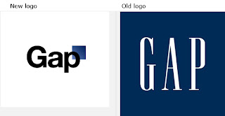
Gap, Inc., the company of billboard-like sweatshirts and the definition of “comfortable apparel,” recently redesigned its logo (for reasons unbeknownst to the consumer) and posted it to its website, only to receive waves of criticism from design firms, mainstream publications and bewildered bloggers and consumers alike. As a result, the company went back to its original logo.
I pulled, for your viewing pleasure, a few comments that were posted on the company’s Facebook page, sourced from Yahoo ® Finance, provided by The Atlantic. Take a gander:
• 'Looks Like it Cost $17 From an Old Microsoft Word Clipart Gallery' notes Abe Sauer at Brandchannel, who deemed it a "monstrosity." The writer explains: It "demonstrates a prototypical brand panic move. With things not going in its favor, the brand decides to change the one valuable element it has going for it."
• Makes Old Navy 'Look Like a Luxury Brand' scoffs Armin Vit at Brand New: "The shaded square on the corner doesn't help at all either -- I'm not one to critique something by saying it looks as if it were done in Microsoft Word but this one is just too unsophisticated to warrant anything more than that."
• This Doesn't Make Any Sense writes David Brier at Fast Company. "It's all a cosmetic band-aid which is so unbelievable for a brand as big and 'mature' as Gap. I'll be surprised if a few people won't lose their jobs as this is basic Branding 101."
• Gap Sales Are Declining Anyway dismisses Jim Edwards at BNet. "There's a clue to what might have triggered the misstep in the fact that same-store sales at Gap are down 4 percent. ... Brand managers need to resist that temptation when they see revenues decline. There are lots of reasons sales might be down -- the recession, lack of discounts, off-trend product -- and not all of those respond to a new trade dress."
• Everybody Hates The Logo ... Except Us Time Newsfeed writer Nate Jones goes out on a limb saying that he "personally does not mind Helvetica, and so this new logo brings to mind visions of a streamlined, technologically dominant future America where everyone wears white suits and cool glasses. Sure, it's generic, but don't you know that in the future everything looks alike?"
My response; Is it really that serious?
As many of many of you know, and for those of you that don’t, I am a PR, advertising and marketing professional. And in my line of work, many times I come across FANTASTIC ads that I believe are so awesomely clever, smart and downright persuasive (as all advertising should be), that it boggles the mind and makes me wonder “who are the geniuses that came up with such an ad.” But, sometimes, you come across some not-so-great ads and wonder to yourself “What genius came up with this crappy ad.” Either way, I never really see it as something to get “up in arms about.”
I must, however, raise an eyebrow to the technique used by Gap, Inc., in its “redesign” campaign because I smell a publicity stunt. The launch of the new logo was a “soft launch,” i.e. no elaborate press conference, news release, promotional campaign, etc. This strikes me as odd. Typically, a company looking to rebrand attempts to lure in new consumers, whoever they may be, while maintaining the relationship with its current market, typically done through new ads, special discount offers- the whole nine yards. This was not done. Also, why would Gap pay a large design firm mega bucks to make a new logo and NOT show it off or, at the very least announce it?
Consumers, I think we’ve been had.
I suspect that Gap wanted to get people talking about them. How best to do that, create an advertising faux-pas and get the entire online community, from Twitter to national bloggers talking about you. Pretty clever.
But, just for the sake of HATIN’, let’s assume that they just did a horrible job at rebranding and that they REALLY did want to change looks and were brutally rebuffed by the American public, I have to ask, WHAT IS THE BIG DEAL?
I’M HATIN’
Gap, Inc.: You should have picked a better design, PR, Advertising and overall marketing team. And have a backbone. I wonder how many of your actual consumers HATED the new logo… how many of them even cared? The new logo was crappy but whatever happened to artistic integrity? You chose the new logo for a reason… stand firm on that.
Logo Designer: Shame on you… well, maybe I shouldn’t be so harsh. Ultimately you got paid big bucks to design a logo that probably took 10 minutes (being gracious) to make. Maybe you guys are the geniuses. I hope Gap, Inc. money is LONG b/c your name will probably be dragged in the mud, at least in the short term.
Bloggers/Commenter’s: Why so serious? Aren’t companies allowed to change and evolve? I know we’re all entitled to our own opinion, but a line needs to be drawn somewhere. I feel like you mercilessly bullied Gap, Inc.; talked about its mama, pushed and slapped it around. Make your comments, but let’s keep it classy.
Fall into the… HATIN’

